 Pablo Iturra
 Pablo Iturra
Sr. UX/UI Designer
2023
After almost five years with the same brand, we have decided to embark on the journey of rebranding. Our goal is to not only change our visual appearance but also our core values and how we want to be perceived. With the help of different workshops, we will involve everyone in the company to define new ways to talk about ourselves.
gofrendly.com ⇢ iOS app ⇢ Android app ⇢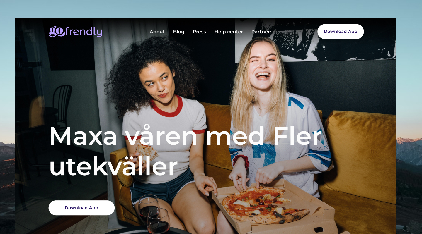
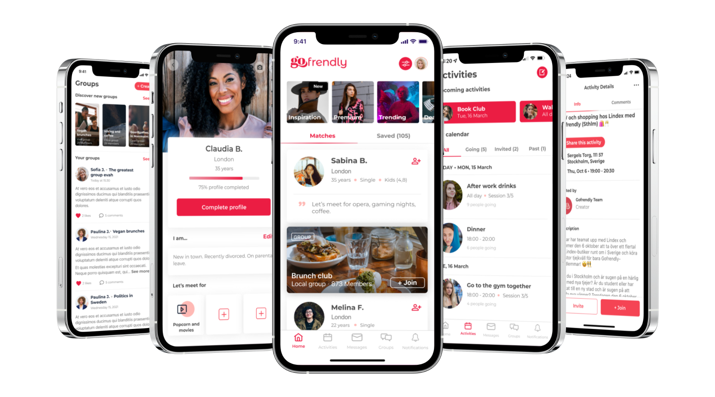
From a technical point of view, our logo was hard to use on various platforms, particularly in digital environments where it is used most. Our marketing team was seeking visual guidance and guidelines on the tone of voice. Our product team also wanted to update the colors and the UI of the app and website.
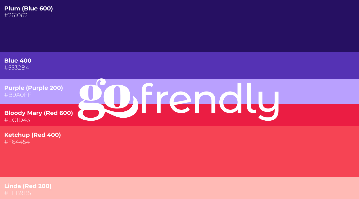
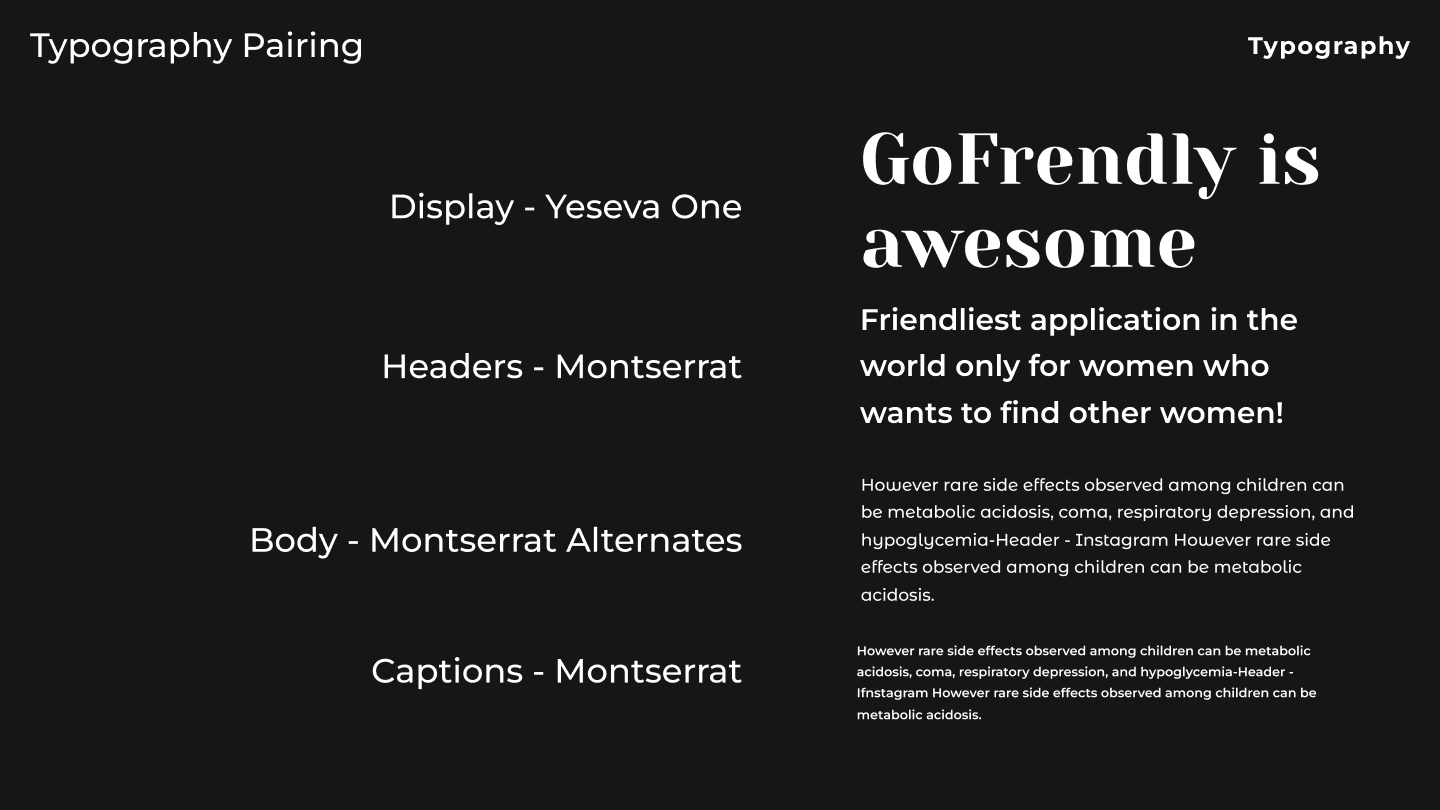
Our brand has always been important to us, and many of our users were attached to our colors and brand. So instead of starting over, we decided to understand what they thought was most relevant and improve from there.
We agreed that our concepts were right but not polished enough, so we refined them. Our colors were ok, but they didn't align clearly enough with our new concepts, so we searched for a more modern version of them and increased our color palette
to have more options.
We finally concluded that using the word "go" as an isotype would work best for us. We could use it to play with different sentences and build a "branding umbrella" for all our different products and platforms like Gopremium, Goexplore, and
Gofrendly app.
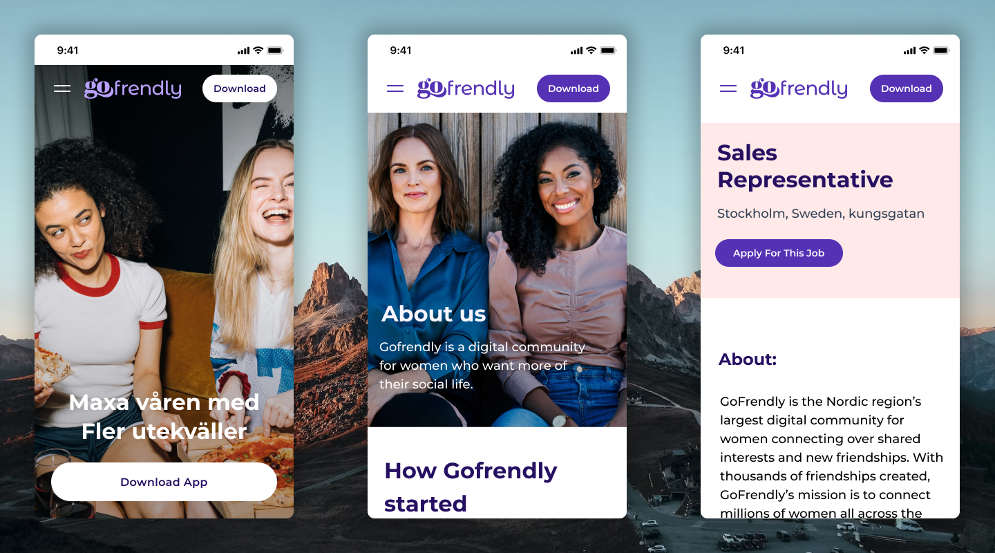
Our brand, like our company, is constantly evolving. After its release, we made iterations and modifications, which helped us work together as a team and know what we could use and how we could use it. Our users felt more aligned with our mission and more engaged with our features inside the app. We saw an increase in engagement, and we were able to communicate more efficiently with our users.
